Basic CGM Graphs
graphing
This is quick post demonstrates graphing Continuous Glucose Monitor (CGM) data from Nightscout data using R. Graphing in R . . . is complicated. As with many things, R is incredibly powerful, but complicated. Today’s post will use the ggplot2 (ggplot) graphic system. For many reasons, I actually prefer the ggvis system, but it doesn’t work as well as ggplot on the Windows platform. The dashboard I’m working on will probably use ggvis, but I wanted to publish this code because A) I have it and B) I wanted to demonstrate some code that works well on Windows.
The objectives of today’s post are:
All code is shown and documented.
Code: The .Rmd file used to create this post is available on GitHub.
Data Location: The data used here can be found in the data sub-folder on the project page. The data set used in this post can be found here. As of tonight (September 16, 2015), the largest CGM data set provided by us was produced on September 16, 2015 at roughly 21:30.
Data Warning: Our current rig has been in nearly continuous use since June 21, 2015. Data collected prior to June 2015 is inconsistent due to limitations with the previous rig and mistakes we made figuring out how to use it. I do not recommend using data collected prior to June 2015 for analysis.
Reproducibility: File names and content are subject to periodic updates. Open a bug or download the repository from GitHub for long-term use. Data sets can be provided privately on request.
The only dependencies needed to run the code in this document are dplyr and ggplot2 from the “Hadleyverse” and pander which produces the formatted table output. To compile the HTML from the .Rmd file you will need the rmarkdown package. Readers familiar with GNU Makefiles can use the Makefile for compiling this document. Others are encouraged to use a tool such as RStudio which simplifies the process.
## Dependencies ----------------------------------------------------------------
## If any of these fail, run the following (capitalization counts):
## install.packages("name_of_package")
library(dplyr)
library(ggplot2)
library(pander)

## Config ----------------------------------------------------------------------

## Prevents pander from wrapping the table @ 80 chars.
panderOptions('table.split.table', Inf)
The following code chunk imports the most recent CSV file available in the data folder and stores it in a data frame called “entries”. This name is used for consistency with Nightscout data structures.
| ## Import data------------------------------------------------------------------
## Retrieves a list of CSV files in the data dir.
## Imports the most recent file, assuming the file naming schema is followed.
files <- dir("data", "*csv", full.names=TRUE)
entries <- read.csv(files[length(files)], as.is=TRUE)
## Data Munging ----------------------------------------------------------------
## Removes unnecessary SGV rows.
entries <- entries %>%
filter(type == "sgv")
## Tells R the "date" column is full of dates.
entries$date <- as.POSIXct(entries$date)
## Week Labels - Useful labels we will be to aggregate by later.
entries$wk_lbl <- NA
entries$wk_lbl[ entries$date >= '2015-06-28' & entries$date <'2015-07-05' ] <- 'Week 1: June 28 - July 04'
entries$wk_lbl[ entries$date >= '2015-07-05' & entries$date <'2015-07-12' ] <- 'Week 2: July 05 - July 11'
entries$wk_lbl[ entries$date >= '2015-07-12' & entries$date <'2015-07-19' ] <- 'Week 3: July 12 - July 18'
entries$wk_lbl[ entries$date >= '2015-07-19' & entries$date <'2015-07-26' ] <- 'Week 4: July 19 - July 25'
|
Nightscout data is a time-series data set. When faced with a time series, I start building graphs first. Everything else can wait. This graph shows Karen’s highs and lows over several days in June.
If you use Nightscout, be aware that the rate of blood glucose change shown here is more dramatic than that shown by Nightscout. Nightscout displays the log of the Y-Axis values. The graph below graphs the raw values. The Nightscout developers have good reasons for doing this and I do not disagree with them. But, to understand the dynamic and often rapid nature of blood glucose change, I think plotting the raw values is appropriate. Karen’s brother, who is less volatile because he does not have gastroparesis, would look very different from what I am about to show you.
This first graph shows us a single day in Karen’s life. I chose this day at random. The graph
| entries %>% filter(date >= '2015-06-22' & date < '2015-06-23') %>%
select(date, sgv) %>% ggplot(data=., aes(x = date, y=sgv)) +
geom_point() + geom_smooth() + geom_line() + labs(x="Date / Time",
y="Sensor Glucose Values(SGV)", title="Sensor Glucose Values Over
Time")
|
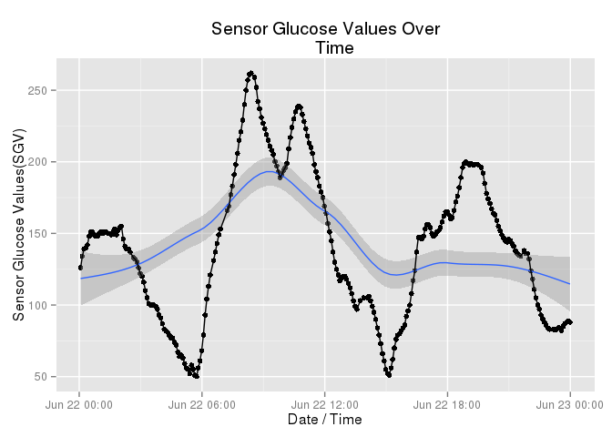
For stats nerds, the blue line is a loess curve. Medically, this was a pretty good day. Karen peaked around 250 and never dipped below 50. But notice, she was never stable. Gastroparesis and stress are evil opponents. This wasn’t a bad day, but she was never really stable. She did not have even a single time where her blood glucose levels were “normal” and stable. She passed through “normal” several times, on her way to hyper and hypo glycemic episodes.
Karen has observed that her patterns on weekdays are different from her patterns on weekends. The following graph was not chosen at random. I selected this to highlight the difference Karen feels exists betwen her weekdays and her weekends.
| entries %>% filter(date >= '2015-07-04' & date < '2015-07-05') %>%
select(date, sgv) %>% ggplot(data=., aes(x = date, y=sgv)) +
geom_point() + geom_smooth() + geom_line() + labs(x="Date / Time",
y="Sensor Glucose Values(SGV)", title="Sensor Glucose Values Over
Time")
|
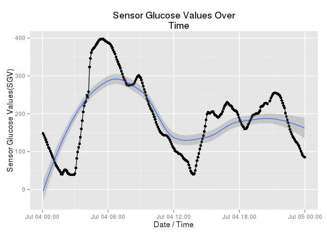
Look at her afternoon (the right side of the graph). Yes, she continues to vary. That’s diabetes. And yes, she had a bad hyperglycemic episode in the AM but look at her stability in the afternoon. That sort of relative stability is unusual for Karen during a weekday.
Coming soon. Multiple day plots. I am going to break this up into multiple posts because I don’t want to write posts that take 30 minutes to read and understand.