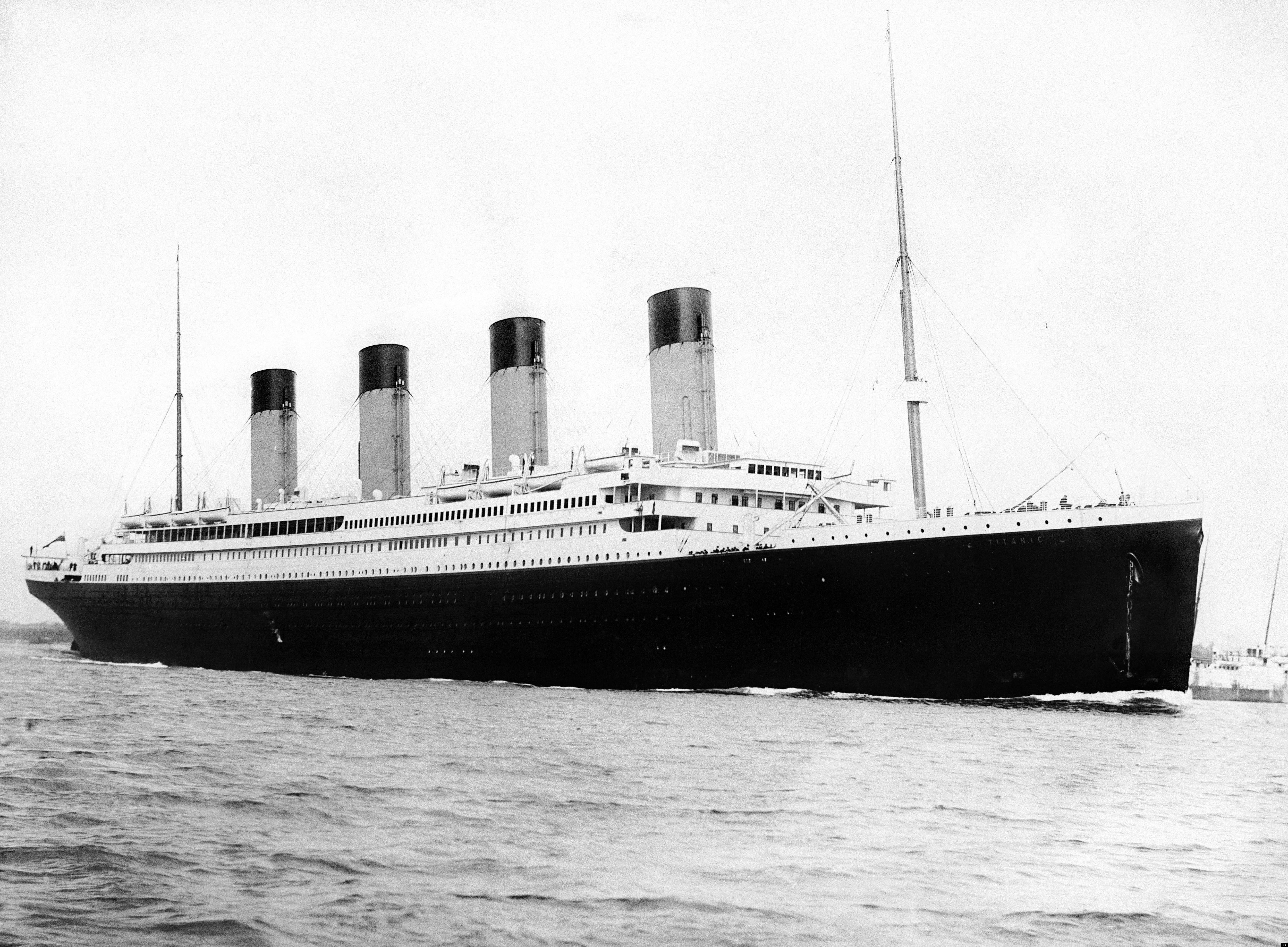
Exploring Titanic Data
- Data: passengers
Don't have passengers?
Use import-passengers.R to get it.
- Code: demo-plots.R
- Will run this code together
- ~30 Minutes
- Followed By: A Break!
Learning Objectives
-
R has many graphical packages
- ggplot2
- ggvis
- lattice
- plotly
- htmlwidgets
- rbokeh
- Today, we use Base R
- Why isn't there a graphic on a page about graphics?
Base R Graphics
- Encourage interactive use
- Easy to remember commands
- Good defaults!
- Thank You: John W. Tukey

Opening Discussion
Plotting functions we will use today:
-
plot()
You've already used this command barplot()boxplot()hist()pairs()
These commands should be mostly self-explanatory
Age
## Remember:
mean(passengers$age)
[1] 30.31759
## Only one variable?
## X axis is row number.
## Can look like a trend.
plot(passengers$age)
## Use sample() to avoid.
plot(sample(passengers$age))

Age by Passenger Class
## X/Y Axis order matters!
plot(passengers$passenger_class,
     passengers$age
    )

Remember Factors?
- Superficially similar to character/string variables
- Tells R a variable is a categorical variable
- Factors have different defaults in
plot()
Age by Passenger Class (Factor)
## Now with boxplots!
plot(as.factor(passengers$passenger_class),
     passengers$age
    )

Barplots
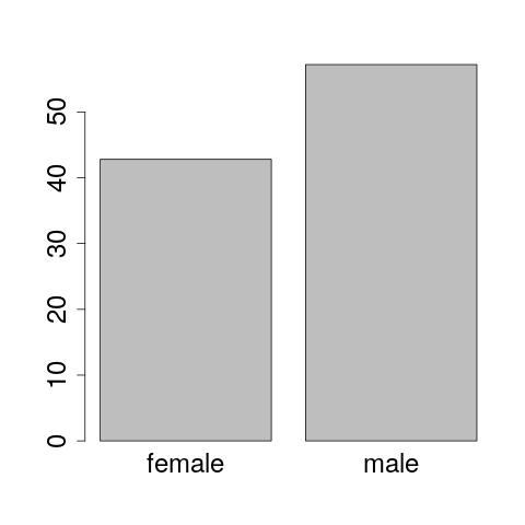
You can't create a barplot with raw data. It needs a table.
# Our passenger data has more males than females
table(passengers$sex)
female   male
   107    143
# Creates a table called tbl_sex
tbl_sex <- table(passengers$sex)
tbl_sex
female   male
   107    143
Passenger Sex
## Input is a table.
barplot(tbl_sex)

## Input is the output of table()
barplot(table(passengers$sex))
STOP! (Teachable Moment)
- SAS/SPSS: Powerful, independent commands
- R: Simple commands work together
- Both methods have advantages
- One reason R is so modular
 Your Turn!
## Learn how to use the prop.table command.
## Use this command to build a table showing the
## proportions of males and females in passengers.
?prop.table
prop.table(tbl_sex)*100

female   male
  42.8   57.2
Your Turn!
## Now use prop.table to build a proportional barplot.
barplot( prop.table(tbl_sex)*100 )
Hint: There's a nice plot on the next slide
Nice!
GET SOME HELP!
- Eventually, we all need some help
- Stack Overflow
- Let's practice finding help
Your Turn!
- Get familiar with this data set. We aren't done with it.
- The following two files include examples of histograms, density plots, etc. Things that might interest you.
- exploratory-plots.R
- advanced-plots.R
- Take a short break before diving into logistic regression
- All materials are accessible outside of this workshop
Take A Break!
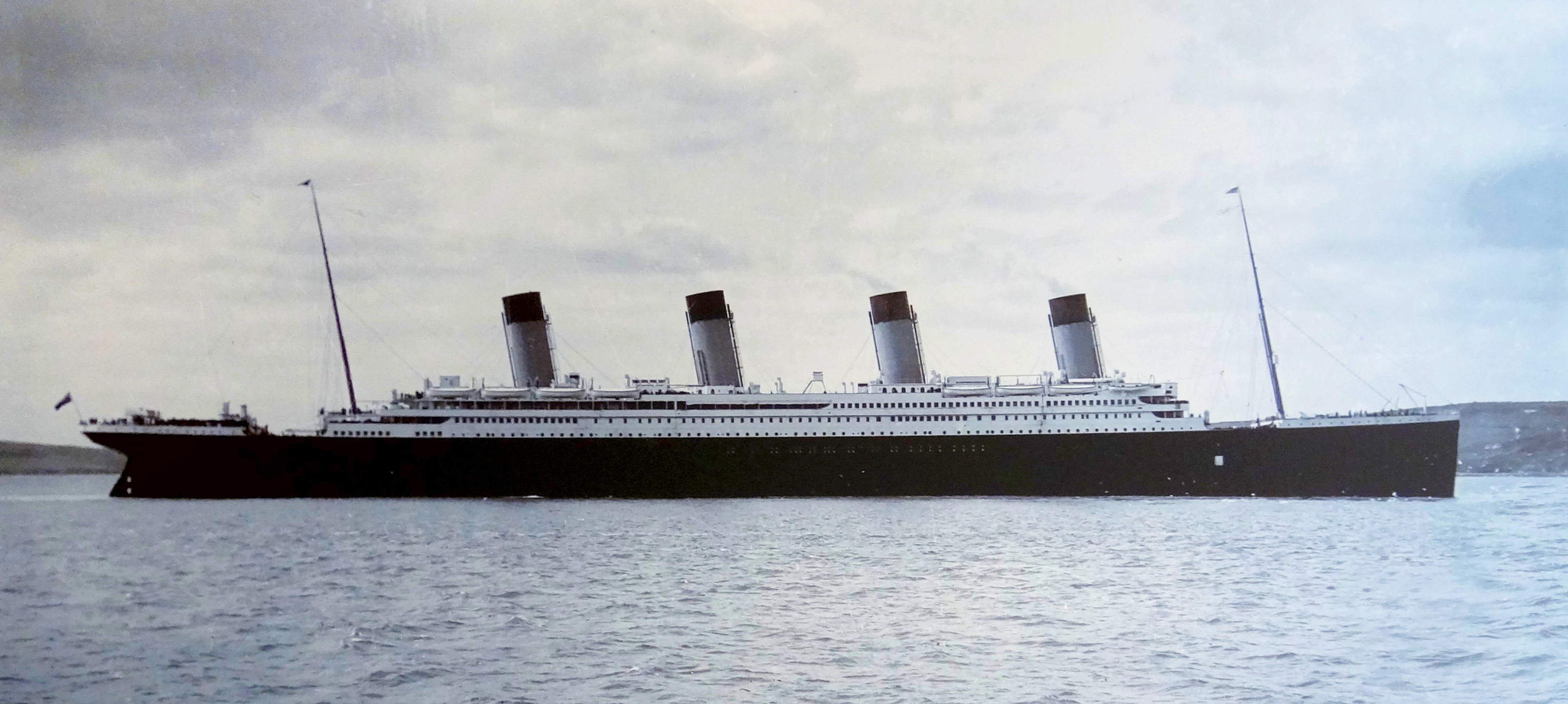
Titanic in Cobh Harbour, County Cork Ireland